Consumers don’t read packaging; they react to it. And in a split second, your product packaging either earns attention or fades into the noise. How to win? By keeping up with the current packaging design trends.
The packaging design that worked five years ago isn’t built for today’s shelves, screens, and expectations. Food packaging, beverage labels, and innovative packaging formats must now deliver utility, personality, and instant clarity, all at once.
This article breaks down eight packaging trends that matter right now, from sustainable packaging innovation to structural design trend shifts, so that you can lead, not follow.
Packaging design trends in 2025.
In 2025, packaging design is getting bolder, more functional, and emotionally resonant. From raw, hand-drawn textures to juicy color palettes and structural innovations that enhance user experience, brands are pushing boundaries across categories.
These trends reflect a more profound shift toward packaging that looks good and connects, performs, and tells a compelling brand story at a moment’s glance. Let’s break down the most significant design moves shaping the year.
Pack portability and convenience.
Portability isn’t a nice-to-have anymore; it’s a requirement baked into the product experience. Today’s consumers, significantly younger, mobile-first audiences, want packaging that moves with them. That’s not just a packaging trend. It’s a shift in how product packaging design serves behavior.
Whether it’s slim-fit cans, single-serve food packaging, or recloseable formats designed for gym bags and car cupholders, portability drives purchase decisions. Look at Prime Hydration: their slim bottle isn’t just sleek, it’s engineered for grip and ease of use in motion. That’s functional minimalism that performs in real life.
This design trend goes beyond aesthetics. Smart packaging choices like textured packaging for grip, minimalist packaging for clarity, and curated frames that guide the eye make a difference. It’s all about a package design that feels intentional, with form tailored to function.
As brand teams evolve their CPG packaging design strategies, mobility must be built into the industry’s foundation for beverage packaging design. The winning brands are designed for the hand, not just the shelf.
Zesty colors for youthful appeal.
Picture a fruit bowl exploded across your packaging: lime greens, mango oranges, banana yellows, raspberry reds, and blueberry blues, all blending in vibrant harmony. It’s a celebration of color, optimism, and playfulness.
Unlike older, heavier palettes, Fruity Hues favor lightness and brightness. These aren’t deep, moody tones—they’re airy and uplifting, chosen to evoke freshness and vitality. The color combinations (typically four to six shades in one layout) are often paired with loose squiggly patterns, rounded typography, and fluid, organic shapes that reflect the palette’s carefree, natural vibe.
A standout example is GOGO Squeez Active. Its packaging harnesses this vibrant palette to energize a family-friendly product with a sporty, health-forward twist. The colors do more than look good—they signal motion, flavor, and fun in a format that speaks directly to active kids and on-the-go parents.
Fruity Hues give packaging a personality boost. They catch the eye, signal delight, and instantly shift a brand’s tone toward fun and approachable. It’s the visual equivalent of a cheerful smile for brands looking to build shelf appeal and connect with Gen Z or family-oriented consumers.
Simplistic scribbles and etches.
In 2025, the polish is peeling back on purpose. The simplistic scribbles and etchings trend is redefining packaging design by ditching the overly refined aesthetic in favor of something raw, tactile, and unmistakably human. Think hand-drawn scribbles, charcoal sketches, and linocut-inspired etches that look like they’ve been scrawled straight onto the packaging.
Why the shift? It’s a design trend rooted in reaction. As AI-generated graphics and hyper-digital perfection dominate the visual landscape, consumers increasingly crave something real that feels like it came from a person, not a program. This approach leans into emotional resonance, making packaging feel more personal, honest, and crafted.
What makes this packaging trend powerful isn’t just its aesthetics—it’s the intention. These imperfect lines, smudged textures, and sketch-like renderings signal that the product inside is made with care. It’s storytelling through package design and becoming a quiet rebellion against sterile, algorithmic visuals. Especially for brands in food, wellness, and craft beverages, this visual language creates a sense of warmth, humanity, and creative freedom.
Sunset gradients.
The Sunset gradient evokes calm, warmth, and natural beauty. While gradients have been a staple in modern packaging design, this iteration taps into a more emotional, sensory experience, channeling the tranquil vibes of dusk and dawn.
This trend uses horizontal gradient flows that softly sweep the packaging like a sky in transition. Think warm oranges, faded lilacs, soft pinks, and mellow blues blending into each other with elegance. It’s not just color—it’s mood.
These gradients are often paired with minimalist design layouts, allowing the color flow to become the focal point. Typography is typically understated, and icons or imagery, if used, are subtle and light. This lets the gradient breathe and draw the eye without visual chaos.
Why it matters: As consumers battle information overload and digital fatigue, they’re naturally drawn to packaging that soothes rather than shouts. Sunset gradients communicate serenity, trust, and comfort—key emotional cues, especially in wellness, beauty, beverage, and food packaging categories.
For brands looking to stand out without screaming for attention, this gradient trend offers a quiet but powerful way to communicate approachability, modernity, and emotional resonance. It’s proof that sometimes, a soft glow speaks louder than bold graphics.
Packaging as brand identity in 3D.
Packaging is a three-dimensional expression. Brands treat packaging as a physical extension of their story, voice, and attitude. This isn’t just graphic design; it’s structural storytelling. It’s also reshaping how packaging designers think about shelf presence, especially in crowded categories like food and beverage.
The shift? Brands are translating visual identity across structure, texture, and form. A matte finish, a unique silhouette, or even transparent packaging that lets product quality speak, every element now plays a role in defining who you are. Hostess nails this with its refreshed food packaging design: nostalgic enough to feel familiar, modern enough to stay relevant.
This 3D approach goes beyond looks. Interactive and personalized packaging features create moments of engagement, while minimalist design choices help reduce packaging waste without compromising style. The result? Packaging that does more than sit on a shelf: it speaks to the consumer, reinforces brand identity, and builds consistency across every format, from fridge to feed.
Front-of-pack clarity = conversion.
Attention is the main currency in the packaging industry, and there are just 3 to 5 seconds to earn it. That’s why front-of-pack clarity has become a critical product packaging design trend. Consumers aren’t reading; they’re scanning. So, packaging must lead with a clear, benefit-driven message that cuts through instantly.
Brands must simplify design elements, emphasizing stronger hierarchy and tighter storytelling on the primary display panel. Think less clutter, more impact. There’s also a rise in a blend of form and function: digital print allows for agile custom packaging that adapts messaging across segments, while interactive packaging helps bridge shelf and digital experiences.
Even vintage packaging is reimagined with modern typography and layout systems to tap into nostalgia without sacrificing clarity. There’s also a sustainability play here. Clear communication supports sustainable materials by reinforcing product values upfront. When consumers immediately understand the what and why, they buy with more confidence and less friction. Clarity isn’t just good design; it’s conversion.
Tamper-evident transparency.
Tamper-evident transparency is a baseline expectation. In high-trust categories like food, supplements, and personal care, consumers want to see that their product is safe, sealed, and untouched. Brands respond with precise safety mechanisms like peel-back seals, shrink bands, and even color-change indicators that visually confirm freshness and integrity.
Take OLLY, for example. Their vitamin bottles use a peel-and-click tamper-proof lid system that’s functional and aligned with their playful, approachable aesthetic. This creative packaging design adds to the brand value while reinforcing consumer confidence.
As consumer preference shifts toward packaging that balances transparency with sustainability, brands explore tamper-proof solutions within flexible packaging formats and recyclable materials. Even vintage packaging and retro-inspired looks are being adapted with modern design elements to signal safety without compromising brand identity.
Whether working with custom packaging design or off-the-shelf formats, tamper-evidence must feel intentional. It’s part of the story. And when done right, it connects trust with sustainable practices, thoughtful packaging material choices, and the creative utility that makes consumers return.
Mess-free dispensing.
Consumers demand precision and cleanliness, prompting brands to innovate with pumps, squeeze spouts, and no-drip valves that enhance user experience and minimize waste. One standout example is Dawn Powerwash Dish Spray.
Its trigger-spray design eliminates the need for a sponge or a sink full of water—consumers spray, wipe, and rinse. This rethink of traditional dish soap packaging solves real usage frustrations and improves product efficiency, demonstrating how packaging can become a key purchase driver.
Incorporating sustainable practices.
Incorporating sustainable practices into such designs is also gaining momentum. Brands are exploring biodegradable materials and recycled content to meet sustainability goals without compromising convenience. Collaborating with a structural packaging design agency can help develop custom packaging solutions that resonate with consumers and support brand activation toolkits.
While minimalist designs have dominated recently, there’s a resurgence of maximalist designs and vintage packaging aesthetics. Integrating vintage design elements with modern functionality can create a nostalgic yet practical appeal, enhancing brand value and consumer connection.
Storage-optimized structures.
Storage-optimized structures are rewriting the packaging design rules because the test begins once your product leaves the store. Today’s best packaging design ideas are driven by how they perform in the home: in the fridge, the pantry, and the gym bag. This shift has pushed designers to prioritize stackability, ergonomic shapes, and even collapsible or flat-pack formats that minimize clutter and maximize convenience.
Think about food products like boxed soups or ready-to-drink smoothies in square or modular formats. They’re made to fit snugly in fridge doors or cabinet corners. This is more than functional; it’s about respecting the consumer’s space.
The latest trends also emphasize sustainability in structure. Brands are experimenting with biodegradable and recycled materials that hold their form while reducing environmental impact. While minimalist structures dominate the conversation, there’s a growing place for bold, maximalist designs that use geometry, texture, and color to stand out—even when tucked away in a kitchen drawer.
Multi-functional packaging.
Multifunctional packaging is becoming a cornerstone of brand innovation and packaging because consumers expect more than protection. They want packaging that does something. Whether it’s resealing, measuring, serving, or storing, today’s packaging isn’t just a container—it’s part of the product experience.
A perfect example? Ready-to-eat cereal cups that double as on-the-go bowls with integrated spoon storage. No extra dishes, no fuss—grab, eat, and toss (responsibly, of course). This is an opportunity for brands to reinforce their value through innovation. By integrating features that align with daily routines, brands elevate perception and usability.
Food products are leading the way, especially as sustainability and functionality intersect. Brands use eco-friendly packaging design approaches that include biodegradable and recycled materials to meet sustainability goals without sacrificing utility.
Meanwhile, bold, maximalist designs paired with consistent brand style guides help these multi-use formats stand out in retail and digital environments. These ideas offer tangible ways for teams working with structural partners or pre-production services to innovate without reinventing the wheel.
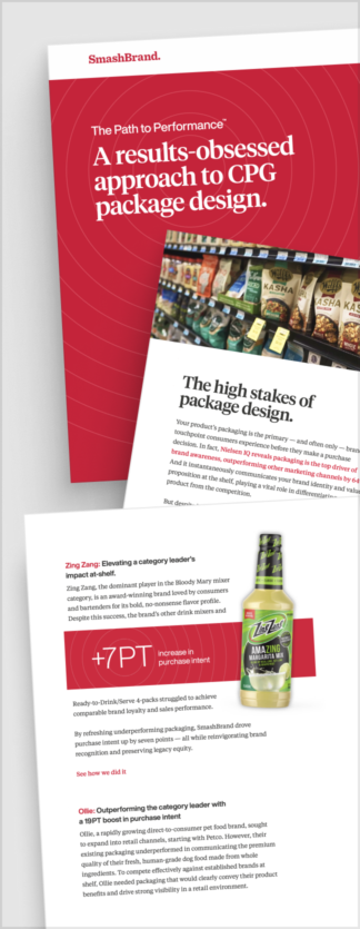
Path to Performance™
Taking a results-obsessed approach to CPG package design.
Learn how SmashBrand’s proprietary process – rooted in scientific principles, informed by data, and validated by your target audience – takes the guesswork out of package design and delivers guaranteed results.
Easy to open and reclose for all ages.
Easy-open and reclose features are necessities. Packaging is being reimagined to serve youngsters and seniors as the CPG industry embraces inclusive design. That means grip-friendly surfaces, intuitive tear points, and ergonomic closures that work—without scissors, strain, or spills.
Flexible packaging formats are being redesigned to accommodate these needs—think resealable pouches with tactile notches or child-safe zippers. These elements enhance creative packaging design while making everyday interactions seamless.
From a production standpoint, integrating accessibility doesn’t mean compromising sustainability goals. Many brands now achieve this balance using recyclable materials and eco-conscious packaging choices. Combining custom packaging design with sustainable practices adds long-term value to the product and brand story.
Accessibility is good design. When executed well, it’s a powerful way to align packaging with real-life needs while delivering on aesthetics, usability, and environmental responsibility.
Refillable and modular systems.
Refillable and modular packaging systems are revolutionizing the consumer packaged goods (CPG) industry, particularly within the food and beverage sector. These innovative designs advance sustainability objectives and enhance long-term consumer engagement by offering practical, eco-friendly solutions.
Implementing such refillable systems necessitates a strategic approach to various types of packaging design. It involves creating household product packaging designs that are functional and aesthetically aligned with the brand’s identity. This alignment ensures a cohesive brand architecture, reinforcing the brand’s commitment to sustainability and innovation.
Moreover, these systems can positively impact packaging design ROI by building customer loyalty and reducing long-term packaging costs. For retail packaging design, offering products with refillable packaging can differentiate them and appeal to environmentally conscious consumers.
Incorporating refillable and modular packaging solutions reflects a brand’s dedication to sustainable practices and positions it as a leader in adopting the latest trends in packaging innovation.
Nice Package
Don’t miss out on our monthly newsletter Nice Package!
Each month, we deliver a data-driven newsletter directly to your inbox, unpacking a critical topic in the FMCG & CPG industry.
"*" indicates required fields
Package design that’s proven to perform.
SmashBrand isn’t just another packaging design agency—we’re the only one guaranteeing your packaging will perform on the shelf. Our data-backed design methodology and accurate consumer testing give you the confidence that your product packaging won’t just look good; it’ll sell. Retailers love it. Consumers respond to it. Your brand grows because of it.
Let’s talk about your project. Book a time with our team.

A seasoned veteran in the CPG (Consumer Packaged Goods) industry, Jason Vaught brings a wealth of knowledge and hands-on experience as the director of content and marketing for SmashBrand. His comprehensive role at the forefront of brand communication ensures that CPG brands remain well-informed about the suite of services SmashBrand offers. Furthermore, his insights derived from the company's strategy, design, and testing services are invaluable to brand owners and managers seeking expert guidance.
From his early endeavors in launching a successful sports nutrition brand that gained prominence in significant bodybuilding and fitness retail spaces to his entrepreneurial ventures in kick-starting multiple brick-and-mortar and e-commerce startups across diverse industries, Jason's career is studded with substantial milestones. Notably, he has innovated numerous products later embraced by leading industry brands, showcasing his knack for anticipating market demands and setting trends.
Jason's journey in the CPG industry commenced at age 21. Over the years, he has worn multiple hats, ranging from a manufacturer and retailer to a distributor and brand owner. This multifaceted experience equips him with the rare ability to offer practical advice grounded in real-world expertise. His mission is to guide and support other CPG brand owners, directors, and managers on their path to success.
Subscribe to
Nice Package.
A monthly newsletter that unpacks a critical topic in the FMCG & CPG industry.
Free Resource.

CPG product repositioning guide.
Explore the five undeniable signs your CPG product needs repositioning along with strategies for leveraging consumer insights for a guaranteed market lift.
Learn More About CPG product repositioning guide.