Your brand isn’t what you say it is. It’s what consumers recognize in an instant. But what happens when your logo is stretched in one place, your colors shift across platforms, and your tone flips between playful and corporate? Chaos. Brand inconsistency erodes trust, confuses customers, and weakens your market presence. How can we avoid that? Through practical brand style guides.
A well-crafted brand style guide is a blueprint for brand consistency. From graphic design and logos to colors and typography, it ensures every visual element aligns perfectly. The goal is to develop a unified visual message.
This guide breaks down the brand style guides step by step. You will learn how to craft a practical style guide that protects your brand, strengthens recognition, and keeps every design element in check. You will also learn about the common mistakes CPG brands usually make when crafting their style guide and how to avoid them.
What is a brand style guide? (And what it’s not)
A brand style guide is a set of guidelines that defines a company’s visual foundation. It serves as a rulebook for the visual brand identity, ensuring that every design element—from brand colors to typography, logos, and imagery—stays consistent across all platforms. A strong brand guide isn’t just about aesthetics—it’s about reinforcing brand recognition at every touchpoint.
Many confuse a brand style guide with a brand guideline that covers messaging or strategy, but they serve different purposes. A style guide isn’t a brand strategy document—it won’t define your positioning, target audience, or competitive edge. It doesn’t dictate brand voice or values—those belong in a brand playbook, not a brand guide. It’s strictly about visual consistency, not how your business interacts with the market.
Why are brand style guides essential?
A well-crafted brand style guide does more than create a polished look—it builds trust and strengthens brand recognition. Clear brand guidelines help internal teams, external agencies, and retailers maintain a cohesive identity, whether launching a new campaign or designing product packaging.
Without one, inconsistency creeps in, diluting your brand identity and confusing consumers. But with a defined brand guide, every logo placement, color choice, and design decision reinforces who you are—without second-guessing.
Steps to developing a brand style guide that works.
Developing a practical brand style guide requires a systematic approach. Companies must start with a comprehensive branding audit and build clear, usable guidelines. Finally, they must ensure internal and external adoption. These steps are discussed in detail as follows:
Audit your current branding.
Before creating a powerful brand book, the first step is to assess where your brand stands today. A comprehensive audit helps identify inconsistencies, align visual elements, and lay the foundation for a consistent brand. Skipping this step leads to a fragmented identity, weakening brand value, and confusing consumers.
A brand identity or architecture agency typically begins any project with this crucial evaluation. A branding audit should focus on spotting inconsistencies across all marketing materials, digital platforms, and packaging. Ask these questions:
- Are multiple logo design variations in use without clear logo guidelines?
- Do brand colors differ across print, digital, and product packaging?
- Is typography consistent across social media, ads, and in-store displays?
- Does imagery align with the brand’s tone, or does it feel disjointed?
Organizing all assets provides a starting point for refining the brand strategy and ensuring that every touchpoint aligns with the desired brand value. A strong brand book will streamline future branding efforts, making it easier for teams to maintain consistency.
Define your brand’s visual identity.
After a transparent audit of your existing materials, the next step is crafting a cohesive brand identity that visually represents your brand’s personality. This process ensures that every touchpoint, from box packaging design to digital marketing, distinguishes you from your competitors.
For example, a premium organic food brand may use earthy tones and serif fonts to evoke trust and tradition. A trendy energy drink may lean into neon colors and sharp typography for a high-energy feel.
A deep dive into competitor branding reveals industry trends and opportunities for differentiation. Analyzing your category’s box packaging design, typography choices, and visual themes helps refine your brand’s distinct aesthetic.
For instance, if competitors in the snack industry use playful hand-drawn illustrations, a brand aiming for a sleek, modern image might opt for clean lines and a minimalist modern packaging design.
Document clear, usable guidelines.
Once you’ve established your brand’s visual identity, the next step is to document it in a way that ensures consistent execution across all platforms. An excellent branding style guide helps designers, marketers, and partners maintain a strong brand identity without guesswork.
The style guidelines must be detailed enough to prevent misinterpretation but straightforward enough that any team member can easily apply them. Overly complex rules can slow creative execution, while vague instructions lead to inconsistencies.
Clear visual examples help teams understand how to use design elements properly. Showing real-world applications—such as packaging, ads, and social media posts—reinforces correct execution and prevents common branding mistakes. This way, brands ensure that every touchpoint reflects a strong brand identity and a consistent brand tone.
Ensure internal and external adoption.
A well-crafted brand style guide is only practical if it is understood and applied correctly. To maintain consistency, brands must ensure that internal teams, external partners, and designers fully adopt the guidelines. This step is critical for brand equity development.
Every stakeholder must understand how to execute the brand’s visuals. It includes training sessions for employees on brand voice development and visual identity and workshops for external agencies and designers to reinforce brand personality development and application.
Core elements of a winning brand style guide.
Every branding decision must reinforce brand recognition, ensuring your identity remains strong across every touchpoint. A well-structured brand book covers essential brand elements, from logos and brand color to typography and imagery.
These brand assets shape consumers’ perceptions of your brand personality, strengthening trust and credibility. Whether launching a new product or refreshing your packaging, following these brand guidelines ensures that every visual cue aligns with the brand story and values.
Logo usage.
Your logo is the face of your brand. It’s often the first thing consumers associate with your products, making it a non-negotiable element in your brand style guide. But a logo alone isn’t enough—how it’s used determines whether it strengthens or weakens brand recognition.
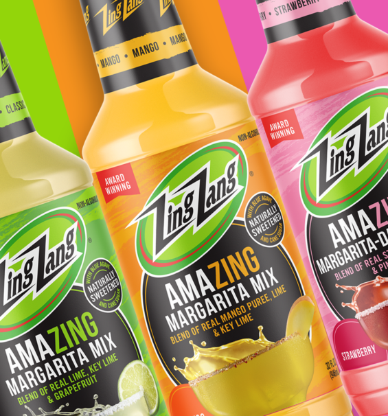
A solid strategy includes multiple versions of the logo to maintain flexibility without losing identity. For example, Health-Ade Kombucha uses its full wordmark with an anchor symbol as its primary logo, reinforcing its handcrafted, health-conscious brand personality. Meanwhile, its secondary logo appears on bottle caps and social media, ensuring the brand remains recognizable even in smaller spaces.
A Dozen Cousins maintains a warm, family-friendly brand personality by using its logo only in pre-approved earthy tones that match its brand values. Their brand style guide explicitly forbids utilizing the logo in non-brand colors or placing it over busy backgrounds, ensuring every touchpoint remains visually cohesive.
Color palette.
Color isn’t just a design choice—it’s a strategic tool in CPG branding. The right brand colors shape perception, evoke emotions, and create instant recognition. A strong color palette ensures a consistent brand identity across all touchpoints, from logo and packaging design to digital assets and marketing material.
Defining and enforcing brand identity guidelines for color usage is critical for a brand manager. Inconsistencies crept in without clear logo guidelines and color rules, weakening brand value and confusing consumers. A well-structured product branding strategy includes both primary and secondary colors:
For example, Spindrift uses a bright, citrus-inspired palette. Bold fruit tones dominate its primary colors, which dominate its packaging design, while softer pastels are secondary colors in marketing materials and digital assets.
Here’s how different hues affect CPG branding:
- Red – Energy, appetite stimulation (Example: Sir Kensington’s Ketchup uses deep red to reinforce richness and boldness).
- Blue symbolizes trust and calmness (for Example, Liquid Death’s blue branding conveys reliability and a refreshing experience).
- Green – Health, sustainability (Example: Once Upon a Farm uses vibrant greens to reinforce organic freshness).
- Yellow – Optimism, warmth (Example: Lemon Perfect’s bright yellow embodies energy and hydration).
Typography.
Typography is more than choosing a font—it’s a critical component of brand identity design that shapes perception, enhances readability, and reinforces brand awareness. Like other design elements such as color and logo, typography must be intentional, consistent, and aligned with the brand’s voice.
A well-structured branding guideline ensures that typography remains cohesive across all brand touchpoints. From packaging to digital experiences, the right brand font helps build a strong brand identity and communicates the brand tone effectively.
Typography isn’t just about looks—it plays a vital role in readability and a brand’s visual identity. A brand’s chosen font must balance aesthetics with function.
- Serif Fonts often convey tradition and trust (E.g., Graza uses serif fonts to emphasize its premium, heritage-driven positioning).
- Sans–serif fonts should feel modern, clean, and approachable (for Example, Poppi’s bold sans-serif font aligns with its fun, youthful energy).
- Script & display Fonts are used sparingly for personality and uniqueness (for Example, Jeni’s Splendid Ice Cream incorporates a hand-drawn script font to reflect artisanal quality).
A well-crafted branding guideline ensures that typography choices reinforce a strong brand identity, improve brand awareness, and align all style guidelines across every touchpoint.
Imagery and iconography.
Visuals tell a story. Whether through photography, icons, or graphics, imagery is a powerful way to reinforce a cohesive brand identity and enhance the overall brand experience. A strong branding style guide ensures that every image and icon used in consumer product branding aligns with the brand’s tone, values, and positioning.
Brands risk making common branding mistakes without clear guidelines, such as inconsistent visuals or generic stock imagery. To avoid this, companies must define imagery and iconography in a brand activation toolkit to create a visually distinct and strong brand.
Photography is one of the most recognizable aspects of product branding and marketing. A well-defined branding style guide should specify the imagery that best represents the brand’s personality and values.
Icons are crucial in consumer product branding, from packaging to websites to social media. A consistent branding approach ensures that icons are uniform in:
- Shape – Rounded, sharp-edged, or custom-drawn to match the brand logo and typography.
- Size – Maintain proportionality across digital and print assets.
- Theme – Simple line art, bold graphic symbols, or illustrative icons should match the brand’s overall aesthetic.
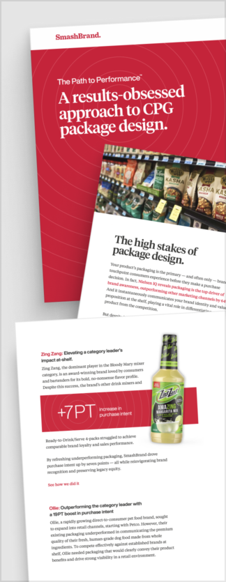
Path to Performance™
Taking a results-obsessed approach to CPG package design.
Learn how SmashBrand’s proprietary process – rooted in scientific principles, informed by data, and validated by your target audience – takes the guesswork out of package design and delivers guaranteed results.
Common mistakes to avoid in your brand style guides.
A branding style guide is meant to bring clarity and consistency. But if done incorrectly, it can do more harm than good. Brands that fail to balance structure with flexibility risk confusing their teams, limiting creativity, or creating a guide that quickly becomes outdated. The following are the three critical mistakes to avoid.
Being too vague.
A brand style guide must be more than a broad overview of colors, fonts, and logos. If the guidelines are too vague, team members, designers, and external partners will interpret them differently, leading to inconsistency in execution.
Instead of saying, “Use blue as a primary brand color,” specify the HEX, RGB, and CMYK codes. Instead of stating, “Keep a modern, clean look,” provide style guidelines with examples of correct and incorrect applications. Actionable guidance ensures that your brand’s visual identity is consistently executed across all platforms.
Being too rigid.
While a cohesive brand identity requires consistency, overly rigid rules can stifle innovation. A style guide should provide structure without restricting creative expression. For instance, if your brand personality development leans toward playful and energetic, allow room for designers to experiment with the design elements—such as using varying brand fonts for campaign-specific activations while keeping core typography intact.
Rigid branding can also make adapting to new formats challenging. The best branding style guides define non-negotiables while allowing flexibility in areas that encourage creativity.
Ignoring scalability.
A brand’s visual identity should be built to evolve. Too often, companies design their style guides for immediate needs without considering future expansions. For instance:
- Will the brand equity remain relevant if the company expands into new product categories?
- Do the style guidelines support digital-first initiatives as much as traditional marketing?
- Can the current design elements scale for international markets or different cultural contexts?
Nice Package
Don’t miss out on our monthly newsletter Nice Package!
Each month, we deliver a data-driven newsletter directly to your inbox, unpacking a critical topic in the FMCG & CPG industry.
"*" indicates required fields
Take control of your brand identity.
A robust brand style guide is the foundation of a cohesive brand identity that drives recognition, trust, and long-term success. Brands risk inconsistency, confusion, and a weakened market presence without clear, well-documented style guidelines.
Now is the time to assess your brand’s cohesion. Are your design elements aligned across every touchpoint? Does your brand’s visual identity support your growth strategy? If your branding feels scattered or outdated, refining your branding style guide is the key to regaining control.
Ready to build a brand style guide that wins? Let’s make it happen.

A seasoned veteran in the CPG (Consumer Packaged Goods) industry, Jason Vaught brings a wealth of knowledge and hands-on experience as the director of content and marketing for SmashBrand. His comprehensive role at the forefront of brand communication ensures that CPG brands remain well-informed about the suite of services SmashBrand offers. Furthermore, his insights derived from the company's strategy, design, and testing services are invaluable to brand owners and managers seeking expert guidance.
From his early endeavors in launching a successful sports nutrition brand that gained prominence in significant bodybuilding and fitness retail spaces to his entrepreneurial ventures in kick-starting multiple brick-and-mortar and e-commerce startups across diverse industries, Jason's career is studded with substantial milestones. Notably, he has innovated numerous products later embraced by leading industry brands, showcasing his knack for anticipating market demands and setting trends.
Jason's journey in the CPG industry commenced at age 21. Over the years, he has worn multiple hats, ranging from a manufacturer and retailer to a distributor and brand owner. This multifaceted experience equips him with the rare ability to offer practical advice grounded in real-world expertise. His mission is to guide and support other CPG brand owners, directors, and managers on their path to success.
Subscribe to
Nice Package.
A monthly newsletter that unpacks a critical topic in the FMCG & CPG industry.
Free Resource.

CPG product repositioning guide.
Explore the five undeniable signs your CPG product needs repositioning along with strategies for leveraging consumer insights for a guaranteed market lift.
Learn More About CPG product repositioning guide.