
Sweetness, flavor, and texture are not the only ingredients required for a prosperous baked goods product. Equally important as the experience of cookies hitting your taste buds is the story created. This can happen through past experiences, bringing consumers into the product experience, or the habit loop a product creates.
Learning about the rich history of a bakery item, its ingredient sourcing, and the baking process helps bring consumers into the experience. When a consumer becomes a part of the product’s story, there is a greater likelihood of customer satisfaction. We’ve all experienced this firsthand through word of mouth, but as marketers, we can also accomplish it through bakery product packaging design.
Package Design Methods For Baked Goods
The big packaged bakery goods question we must answer upfront is figuring out which direction you should go to sell your product. The answer to this question can be based on current brand recognition, retail positioning, and overall branding strategy.
Here’s a look at the two approaches when designing food packaging that requires a “fresh” look.
A Clear Approach To Packaging For Bakery Items
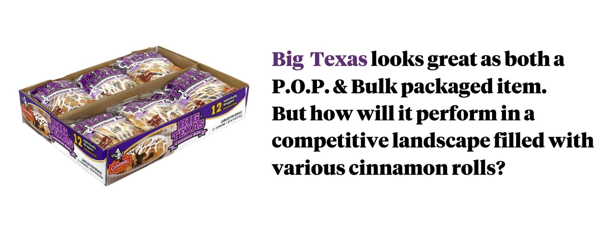
There’s no better way to stimulate a sweet tooth than through the visual stimulus of seeing a pastry or dessert product. Many brands of baked goods lean on transparent packaging to sell their products. This works when positioned at the front counter against lesser “fresh” looking products, but what does it work when a cinnamon roll is sitting alongside 7 other cinnamon rolls?
Designing The Bakery Items Visual Appeal
The other approach you can use with baked goods packaging is applying appetite-stimulating graphic designs to sell your products. Whether it’s flexible packaging or flat surface boxes, removing transparency provides greater design real estate to distinguish yourself from the competition.
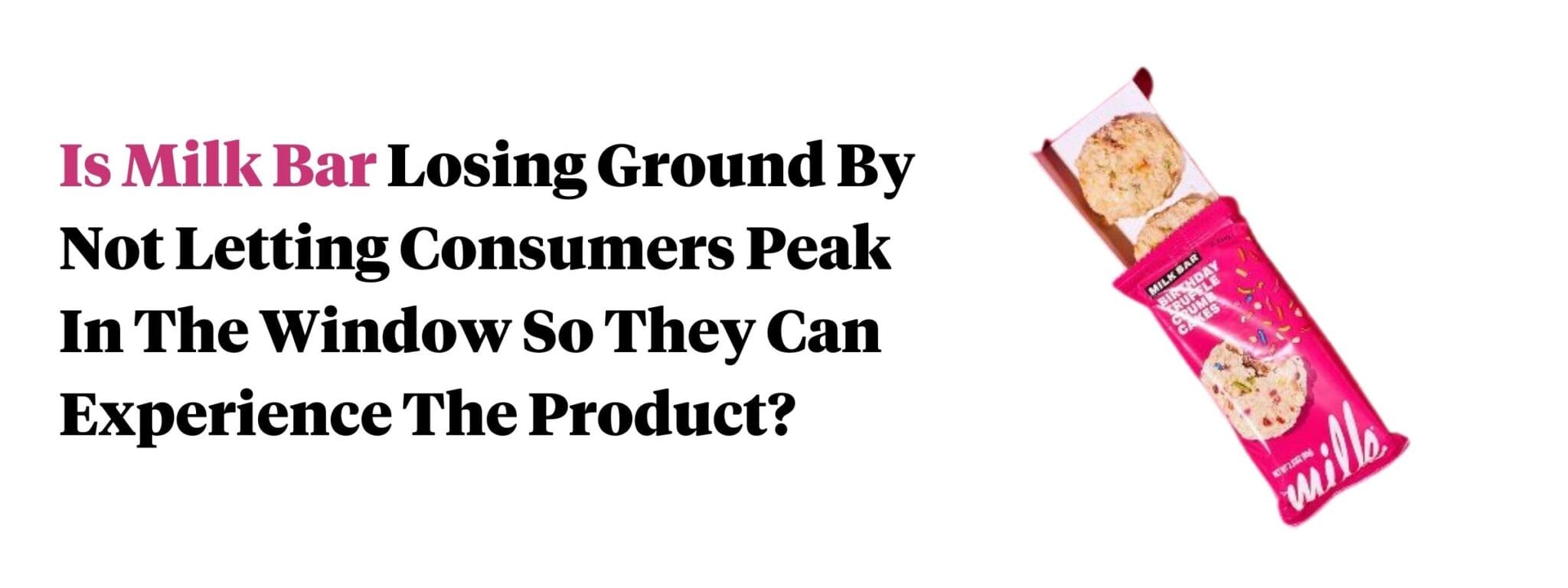
Does this milk bar packaging work? Or would you like to see one of their cookies displayed through a window?
Fundamental Packaging Design Strategies For Baked Goods
Which of these three options will you choose?
- Take a product forward approach with fully transparent packaging.
- Depend on a compelling package design that sells through colors and fonts.
- Find a balance between the two by using a more custom bakery packaging material.
In any of these design strategies, there are two best practices that apply to almost every packaging for a bakery product.
1. Mimic a bakery
A growing trend in much of food product packaging design is creating a look that resembles a walk-in establishment. How can you make your baked goods product packaging distract consumers from ingredients and shelf life and have them feel as though they are choosing from a row of pastry items?
2. Keep it fresh
Your packaging design shouldn’t make your product look like day-old discounted products at the local bakery. Attractive packaging in this CPG category means using words and imagery appealing to freshness, even if manufacturing the product weeks or months ago.
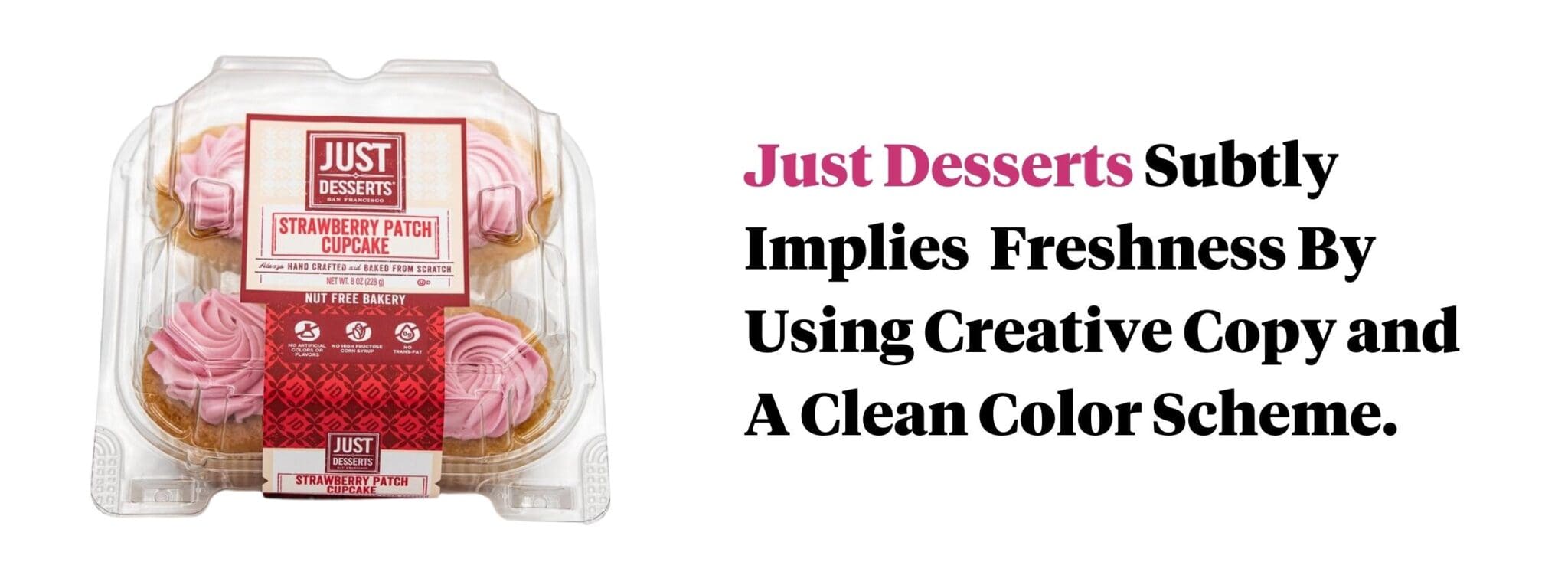
We like the look of this bakery packaging box by Just Desserts. They found the perfect balance by using sales copy that makes you feel as if vendors delivered the ingredients hours before they baked the product to perfection.
Examples of Winning Baked Goods Packaging Design
To stimulate your design appetite, we’ve created a list of bakery product packaging designs with at least one feature we like. Some may seem obvious, whereas others have more subtle points of strength. Let’s dig in.
Carbonaut Bread
Carbonaut’s low-carb gluten-free line covers a lot of necessary grounds for the cluttered premium bread category. The appropriate use of a front window and transparent sides and rear showcase the quality of the bread. Consumers can clearly recognize and easily understand the purchase drivers, even with a predominantly transparent package.
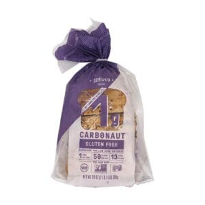
Carbonaut takes a fun approach to a dry CPG food category.
Walmart Unicorn Ice Cream Cake
You wouldn’t think about Walmart as being someone for cake packaging ideas, but they’ve got a unicorn amongst their most often boring packaging. Instead of using a closed-off cake box, the ice cream packaging showcases the unicorn both in its full glory and single slice.
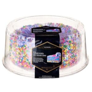
Traditional cake boxes have met their match, fighting for charm against this kid-focused visual appeal. Even on the shelf, Walmart assures parents and kids that this cake looks great on any birthday or celebration.
Mason Dixie Biscuits
Mason Dixie must have read our minds when creating this biscuit box design. Their play on fonts and colors that resemble chalk and a chalkboard makes you feel as if it’s “today’s special” at your local breakfast house. FYI, if you haven’t tried these, they make you feel a little special each time you take a bite.
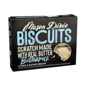
Mason Dixie is clear and concise with its product messaging. By minimizing the word count, purchase drivers such as flaky and buttery stand out as features of the product even when not put into bullet form.
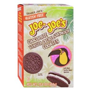
Trader Joe’s Joe-Joe’s Cookies
Joe-Joe’s Chocolate Vanilla Creme Cookies is not a traditional approach to cookie packaging design. The package looks like a graphic design intern has taken their first stab at package design. But, when you understand Trader Joe’s culture, you see why this packaging design resonates with consumers.
Trader Joe’s establishes an association with a background design resembling many team members t-shirts.
Entenmann’s Pies
Most of us remember the pastries we enjoyed as a child. The battle wasn’t always between one store-bought brand and another. It may have been the store-bought Entenmann’s Apple Pastry vs the McDonald’s Apple Pie. The battle wasn’t about quality but branding the experience of comfort from a company you are familiar with.
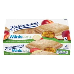
Many throwback pastries still exist in today’s grocers, with almost all of them in desperate need of a brand refresh. Entenmann’s has done a good job of retaining the critical brand elements in their most recent design while creating a “fresher” look. They’ve also done a good job recognizing the need for purchase drivers that answer the questions being asked in the consumers mind. “Made with real apples” may seem boring, but it’s what they need to bring their iconic brand into the realities of today’s CPG landscape.
Rubicon Bakers Cupcake
Hiding the stunning look of this product would be a disservice to the brand and potential Rubicon consumers. Thankfully, Rubicon Bakers let their cupcake design shine by using a label that celebrates the pink on black cupcakes.
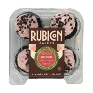
The choice of cursive script font helps further the handcrafted approach to their products. An important reminder of how font choice isn’t always about looks but about how it enhances the story a product tells.
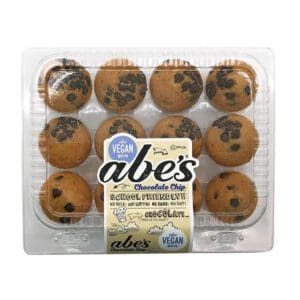
Abe’s chocolate chip muffins
Abe’s Mini Chocolate Chip Muffins are a good example of correctly using maximalism in packaging design. This bakery label design goes against some of the other examples we’ve previously applauded, but for good reason. Abe’s understands that their target consumer is the mom shopping for a sweet and healthy treat to put into their kids lunches.
The artistic approach to this muffin packaging design includes 7 key purchase drivers that reinforce the fact that this product belongs in a kids lunch.
Baked Goods Packaging Design Agency
Looking for a bakery product packaging design that outperforms the competition? We can help. Book a time to discuss your design with our brand development and packaging design agency.
Subscribe to
Nice Package.
A monthly newsletter that unpacks a critical topic in the FMCG & CPG industry.
Free Resource.

CPG product repositioning guide.
Explore the five undeniable signs your CPG product needs repositioning along with strategies for leveraging consumer insights for a guaranteed market lift.
Learn More About CPG product repositioning guide.