
Are you looking for packaging design ideas to get your creative juices flowing? You’ve come to the right place. This article will give you a wide lens to look through when considering your product packaging design. This article provides examples and insider information about why these products capture attention.
You won’t find us stating, “well, isn’t this a lovely package” in this article. You will find our examination of product packaging and, based on our extensive consumer testing for CPG brands, what we feel is impactful to the product’s success on-shelf. Whether you are a graphic designer, marketing director, or CPG brand owner, we hope this article offers insights into how to create impactful packaging for your company.
Where To Find Package Design Inspiration
A note about sourcing inspiration before we get started: whenever you have designer’s block or can’t find a creative packaging strategy, looking at other categories is a good idea. The idea of creative packaging in your category might already exist in a related category. All you have to do is look at what’s working over there, consider your consumer demographics, and then apply it in a way that works for your category.
Our Curated List of Exceptional Packaging Design Ideas
In this list, you will find big names with heavy brand recognition and smaller brands you’ve probably never heard of before. All of these designs fit into one of the major CPG categories where there is stiff competition. Be sure to reach each description if you want to know the specific design considerations your brand can learn to understand.
Amy’s Gluten-Free Burrito
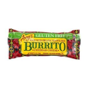
Amy’s brand equity is among the strongest in the natural food industry, with a product in almost every CPG category. But when you are required to carry over so many aspects of your brand resonance, creating one-of-a-kind messaging that differentiates you from other nearby products can be difficult.
While we do not consider Amy’s product packaging a home run, their gluten-free burrito has packaging differentiation in how its gluten-free message rings clear. While maintaining the same graphic design as found across many other products, the purchase drivers of gluten-free with organic ingredients are clear on the front of the package.
Snapple Elements
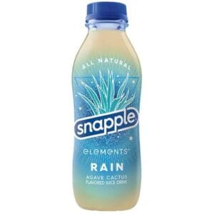
When you have a brand differentiator stating that your product has the best stuff on earth, you better live up to the hype. With a slogan well ahead of its time, Snapple must live up to its original promise. The term “best stuff” pertains to food and beverage, and Snapple is changing along with it.
Sometimes, with line extension comes a brand refresh. Snapple addresses the key elements of packaging design with their new Snapple elements bottle design. The play-off of natural elements subtly speaks to Ayurveda, where natural ingredients thrive.
Starbucks Nitro Cold Brew
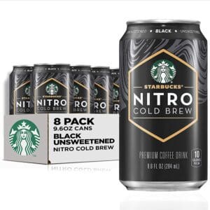
It’s easy to forget how successful Starbucks is with its CPG product line. With over 30 billion in annual sales, the leader in coffee roasting is also a heavy competitor in grocery stores. But it isn’t just brand identity that wins Starbucks business. Their packaging designs follow best practices and one-of-a-kind strategies.
Their Nitro Cold Brew emphasizes “nitro” over a cold brew. Why? Because there are plenty of cold brews across national grocers. Along with nitro, the use of “premium” supports the product’s price. The can packaging design features fluid design elements, and the center logo has a near 3d effect.
Evian Natural Mineral Water
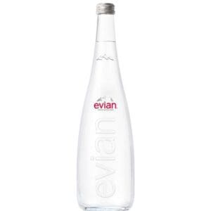
The strength of Evian’s premium water offerings is in the brand story. So it makes sense how brand identity is the focus of their water bottle design. The bottle features few elements and depends on the brand name as a purchase driver.
When we think of premium water, we think of restaurants that pour your glass out of fancy bottles. Except for the brand’s name, the water is the shining star throughout the experience. Evian hopes to have the same effect with its glass bottle design.
Maple Hill Organic Grassfed Milk
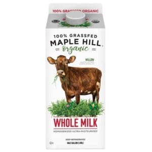
Consumers aware of the unsafe dairy practices by most farmers are looking for two health considerations in their milk. They want pastured grass-fed (what about grass-finished?) cows who are not eating sprayed grass or finished with pesticide-infused feed. But with so many brands following this same approach, how does a product differentiate itself?
Maple Hill Organic farms took a multi-mention approach. The carton packaging design states organic three times and grass-fed twice. What moves the needle is the image of a cow chewing on grass and the description communicating the cow’s name and its farm, all on a clean white background. This screams natural!
Lipton Sweet Tea
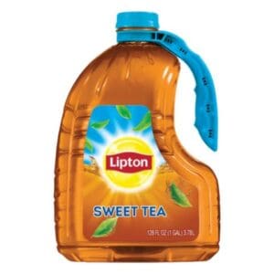
Lipton’s jug packaging says, “we know what you like and how you like to drink it.” Why such an investment in a custom packaging design? Perhaps popularized by the Duck Dynasty’s Si, many people like to drink sweet tea straight from the jug.
The design itself has a central focus on brand identity. All elements send you to the center of the package, where Lipton pops off the label. Perhaps through package design testing, but Lipton decided not to compete against tea brands positioned as natural alternatives with more profound product stories.
Stellar Braids Pretzels
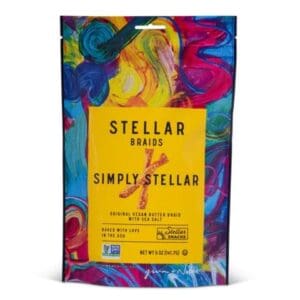
The common theme of a CPG category can be a complete mismatch with the consumers who purchase the products. Brands often follow suit and change the existing theme hoping to align and differentiate. In these situations, a disruption in a package design can lead to a fast swing in market share.
Stellars Snacks is one of those disrupters entering the stale pretzel category, creating new flavors, a more exciting story, and better ingredients. They decided their snack packaging design would go against the grain with such a novel approach. The design features bold abstract colors with a centered tablet, making the name and description visible.
Primal Kitchen Avocado Mayo
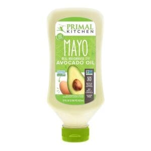
You’re going to wanna squeeze this! While that’s not Primal Kitchen’s product slogan, that’s how you feel when you view their avocado mayo design. Primal Kitchen’s competitors do their best to hide the fact that it is avocado and instead focus on less saturated fats or lower calories. Mark Sisson and the team recognized this and said, “hey, who doesn’t love avocado?” and made it the focal point of their packaging.
The ribbon of excellence showcases all the critical product features people look for from mayonnaise alternatives. The text box adds the purchase drivers consumers don’t expect but appreciate. Overall, the color scheme works well with the transparent packaging showing the off-white mayo.
Tree Top Fruit+Water
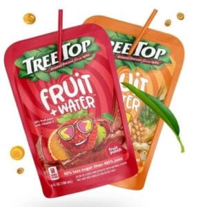
How do you know if your packaging will be a hit with both parents and kids? Through consumer package testing, of course! In a package refresh, TreeTop experienced an 18% increase in purchase intent over Capri Sun and a 22% increase in preference over Honest Kids.
When designing packaging for kids, remember that while kids might point at the shelf, parents are the ones who have the final say. TreeTop’s design speaks to kids, whereas the messaging resonates with health-conscious parents.
MeUndies Mystery Pack
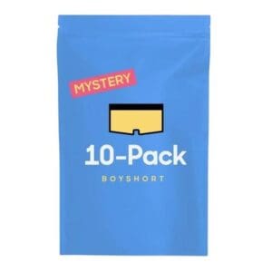
Even apparel packaging is experiencing a shift thanks to Gen-Z gaining a more prominent influence in CPG purchases. Unique packaging that speaks to the “adulting” audience is less about branding and more about the experience.
MeUndies approaches experience uniquely with their mystery six-pack boxer brief. The packaging design doesn’t offer much to the eye, but isn’t that the point? Any design style might lead consumers to expect a particular style inside, which in most cases, will lead to disappointment.
While we thought we’d never see a day when surprise underwear would show up at our doorstep, MeUndies has a pitch worth trying.
Olly Sleep Supplement
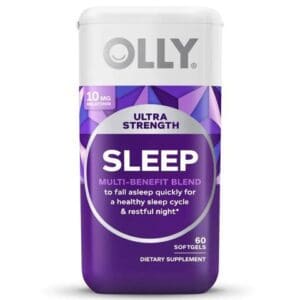
Compared to most CPG categories, the nutraceutical industry may be new, but the approach to packaging design is old. Traditionally, we find plain packaging that looks like it’s in a 1980s health store or in-your-face packaging in bodybuilding stores.
There seemed to be a gap in the market for those who appreciate a sleek and stylish look. Olly capitalized on this market whether their custom packaging design looks like a piece of modern furniture. In a smart move, they marketed their modern packaging design to moms who appreciate a contemporary style.
Truff Hot Sauce
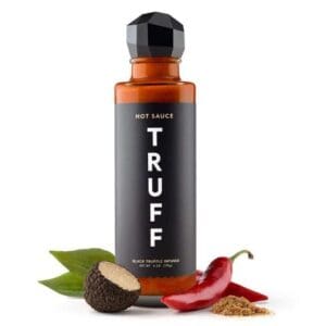
Minimalism meets sophistication with this packaging design. Truff is taking the world by storm with its truffle-infused hot sauces, and they are charging a premium price across a commodity competitor landscape. The bottle features a custom cap and straightforward label using a minimalist packaging design approach.
While their branding has yet to reach the mainstream, the name is unique enough that it will cause a potential customer to look further. Once they get their hands on the product, they experience the one-of-a-kind features that encourage them to take a chance on the product.
Dr. Bronners Soaps
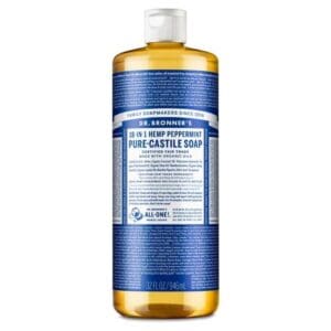
Minimalism isn’t the solution for every brand. Taking the opposite approach might be just what the marketing Dr. Ordered. Speaking of doctors, Dr. Bronner’s soaps exemplify a maximalist packaging design done right. The label includes the founder’s Moral ABCs across the entire label.
While the overall theme of this label design is decades old, the mainstream understanding of a purpose-driven company on a mission is relatively new. If ever the time comes when they decide to perform a packaging refresh, we sure hope they test extensively to determine the long-term consequences of such a decision.
Seventh Generation Detergent
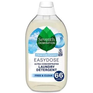
This brand has been a category leader since it hit Target’s shelves. Right time, right place? Perhaps. Sustainable packaging design gained traction right around the time this brand hit the mainstream. But it isn’t just timing that makes this brand a success (after all, it started in 2007); the design also plays a role in its success.
In a category with lots of colors, Seventh Generation took a fresh approach to their design. Their design features clean imagery with a brand value proposition of “clean with a purpose.” As a part of their custom packaging, they saved space on the label design by imprinting the recycle logo directly onto the bottle. Consumers might have a better time recognizing the recyclable packaging when it is not a part of a sticker-applied image.
Red Gold Tomato Love
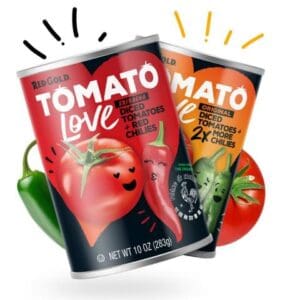
How do you approach a giant food category with such heavy competition? Rather than kick the can down the road, you expose stale packaging for what it is and find a niche that excites consumers about your product.
That’s what Red Gold Tomatoes accomplished with this canned food packaging design. We had the good fortune of working with Red Gold Tomatoes on this project. Our work together yielded their product a 2x sales increase in the first three months.
Humm Whole 30 Approved Kombucha
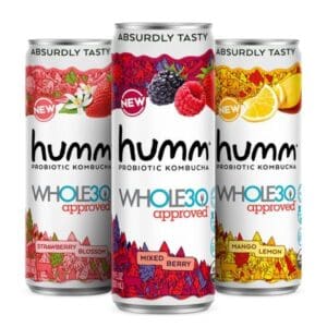
Diet trends come and go, but Whole30 seems to have found a permanent home on CPG shelves without producing a single product of its own. Instead, brands use the Whole30-approved logo to differentiate themselves from the competition. While many have not attempted this whole food diet, most of us recognize it as an intelligent nutrition strategy.
Humm Probiotic has taken grocers by storm with their zero-sugar Kombucha product. However, the problem is that it targets the sugar-free crowd rather than the whole-food crowd. Rather than create a sub-brand requiring Humm to find a branding position, they put whole30’s logo on their existing beverage packaging design, calling it a day. The design features the same brand elements but incorporates a new headline of being absurdly tasty.
This packaging design example shows us the power of leveraging existing consumer attraction to benefit your brand.
Intelligentsia Coffee
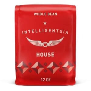
Before premium artisanal coffees were a thing, Intelligentsia was packaging delicious cups of freshly roasted coffee beans. Now, they compete against national roasters entering the small batch game and local roasters focusing on a specific territory. Such emergence of competitors puts stress on a brand, and without a compelling design, it’s hard to capture attention when hundreds of other brands are on the shelf.
The Intelligentsia coffee packaging design starts by using a vibrant red package. It’s clean, so it doesn’t disrupt consumer’s hope for a minimalist look, but it stands out compared to the traditionally dark colors on the shelf. Once you grab the bag, the story unfolds as you go through the packaging experience, ending in trust that this is a one-of-a-kind coffee.
It Cosmetics Hello Results Face Cream
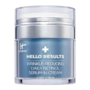
Sometimes your product name is the beginning purchase driver for your product, which is an accurate statement for the cosmetic brand Hello Results. This successful cosmetic packaging design example walks consumers through each product’s benefits. The product name is the headline, and the three features are the benefits. This design must have been a copywriter’s dream come true.
It Cosmetics commands a $69.00 price tag for this 1.7 fl. oz product. But is there a price people will pay for immediate results? Since this is what the name implies, the call to action is strong enough that with a sprinkle of social proof, Hello Results sets the sales stage. They are positioned to sell their facial lotion to those willing to do whatever it takes to reduce wrinkles.
Kiva TCH Infused Chocolate
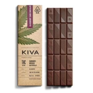
The idea of cannabis edibles isn’t new, but consumer demographics have changed. But we’ve come a long way from local shops being the exclusive source. Therefore, brands need to create a cannabis packaging design to attract a more mature audience.
Consumers of TCH products have grown up. Now, they might alternate an evening where a glass of wine is the preferred means of relaxation to a TCH chocolate bar to take the edge off. The Kiva chocolate bar created this look, and the custom box packaging design is stunning. The embedded leaf with unique flavors makes the product an experience of its own.
Hope Families Austin Hope Wine
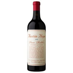
Since wine is one of the oldest beverages in the world, there is much history in this CPG category. We can associate wine with almost every historic event in the United States, including our founding fathers, whose 4th of July celebration included fortified wine.
Hope Family has a wine label design that matches this historical period with a label that resembles the Declaration of Independence. The historic look offers a classic level of sophistication and tells a story on the front of the label. It’s a beautiful thing.
Whistle Pig Whiskey
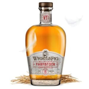
There is stiff competition in the alcoholic spirits category. In a competitive landscape filled with luxury packaging at every turn, finding a brand differentiator means more than having a premium appearance. Distinguishing yourself with any alcohol packaging design means finding a segment of the consumer demographic that will most embrace your brand.
In this brand refresh, we worked with Whistle Pig Whiskey and created a distinguished look that “distinguishes” them from the competition. The result was a 22% increase in brand revenue and a 16% increase in capturing their target market.
Essential Bakings Take & Bake Bread
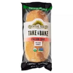
To some, the idea of taking and baking means unnecessary work, whereas others find it to be aromatically therapeutic with minimal effort. Hence why take-&-break bread still exists. But with a small demographic seeking this niche category, having the correct purchase drivers on your product is necessary for capturing the audience who isn’t searching but is interested.
The Essential Baking Company’s take-&-bake bread targets the critical reasons many people buy food products. Their bread packaging design presents organic several times, places hot & fresh (even though it isn’t at the time of purchase), and expresses how there are no unnecessary ingredients. All leading to grab-and-go purchases from consumers who stumble upon this product.
Fine & Raw Chocolate
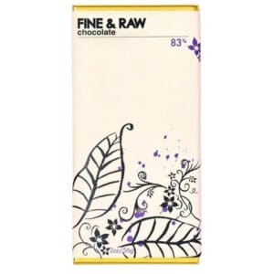
What’s the first thing that comes to mind when you think about chocolate? Is it Lucy hurriedly picking and packing chocolates on a conveyor belt? Or is it the idea of an artistic scientist working their magic to craft the most delicious bar ever produced?
The growth of chocolate is more like the latter. An obsessed individual (or company) whose life mission is to produce chocolate that changes the world. How do you convey this message with your chocolate bar packaging design? Fine & Raw lets an artist’s expression be the focal point of their packaging.
We find the primary purchase drivers within their product name, Fine & Raw. They’ve decided that these are the most important metrics for purchase intent and what consumers care about most. With much white space, this creative packaging design has nothing to get in the way.
See’s Candies Snack Collection
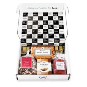
The snacking category is busting at the seams and is finding itself in CPG categories it did not expect. Like vending machines, sweets sneak into the snack industry, presenting themselves with designs resembling snack packs.
Sees entered this arena with their snack collection boxes. While we were not present during the packaging design process, we’re confident that bringing their iconic look synonymous with a holiday packaging design into this category was challenging. How can they integrate their brand palette into a category where colors are bold and abstract?
See’s approach to this snack-candy packaging design keeps the outside brand assets the same while letting the inside colors pop to enhance the experience.
Smucker’s Uncrustables
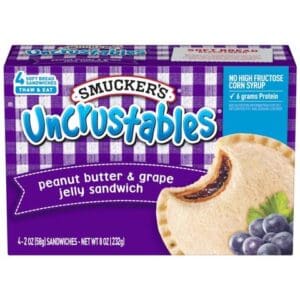
Is anything more frustrating than a kid asking a parent to take the crust off their bread? Busy parents don’t have time for such complexity when packaging lunches. Uncrustable solves this problem but then makes crust-free, fully prepared PB&Js.
Many excellent ideas go unnoticed, especially when stuffing them behind the glass in the frozen section. But with a frozen food packaging design like Uncrustable’s, being noticed behind the glass isn’t that hard. Like Fruit+Water, this design satisfies the fun-loving kid and the health-conscious parent. Correctly positioning the health purchase drivers above the enlarged product draws attention to this box section.
Bring Your Packaging Design Ideas To Life
At SmashBrand, we leverage extensive real-world consumer testing to help CPG companies design the best-performing package for their product. When performing packaging design testing, we eliminate subjectivity in order to ensure accurate shelf sales expectations.
Subscribe to
Nice Package.
A monthly newsletter that unpacks a critical topic in the FMCG & CPG industry.
Free Resource.

CPG product repositioning guide.
Explore the five undeniable signs your CPG product needs repositioning along with strategies for leveraging consumer insights for a guaranteed market lift.
Learn More About CPG product repositioning guide.