
Are you more interested in a simple yet unclear packaging concept, or do you gravitate towards products whose purpose is made clear by elegant packaging designs? Since you are reading an article about minimalist packaging design, we will assume you have a tendency towards simplicity.
Either way, you are reading this article to discover how to create a winning design and avoid any packaging design mistakes. might assume that the biggest mistake in minimalist packaging design is designing as though consumers immediately recognize what the product is and what/who it is for. We hold this assumption for established brands and an essentially unknown product or brand.
Before You Jump On the Minimalistic Design Bandwagon
Let’s remind you about the history of one of the simplest designs in history. If Apple started with its current logo and branding, the public would have assumed it was in the pre-masticated fruit business and continued buying Tandy CoCos. Looking at a successful brand with minimal product packaging and stating “we should look like that” sounds like a good idea. Still, we earn minimalism only after first establishing brand equity.
We’ve written topics around minimalism such as minimalist logo design, but this article covers the entire package design experience. Besides learning the biggest mistake, you will see minimalism in product packaging through a completely different lens. By the end of the article, you will understand when and be aware to take a minimal approach to everything from your packaging material, branding, and design.
Let’s dive in.
What is Minimalist Packaging?
SmashBrand defines minimalist packaging as when consumers perceive the package, design, or to be simple, clean, and less noisy than other products within its respective category. The industry often assumes beyond this minimal packaging to be based on its environmental impact.
Without diving deeper into the “why” for a minimal design, you may waste your time in product development. Without understanding which lever drives consumers to buy, you might strip away important components of a product’s success.
Just as there is no single “right” way to design a package, there’s no single “correct” concept of minimalism. Yes, on the surface, we can identify products leaning towards minimal rather than elegant packaging designs. However, this doesn’t mean we know the purchase driving impact of less excessive packaging or if it’s driving it at all.
The point being, when your product is completely foreign to the public, a box with nothing but a simple logo may lead to less interest than you hope for.
Should Your Brand Embrace Minimalism?
Deciding whether to embrace minimalism in your product packaging depends on many factors. While you may have minimalism built into the fabric of your company, it doesn’t guarantee that your brand will benefit by having a simple packaging design.
What simplicity means to you, and the consumer, may be different. A simpler design is determined by the type of customer the category attracts and the current competitive landscape. In a category known for minimalist designs, your simple approach may be too loud. On the flip side, in loud categories, we can consider slightly less aggressive as a minimal approach.
It comes down to the current design trend and consumer expectations.
When Minimalistic Packaging Design Goes Wrong
Picture a row of white bottles with black fonts across an entire aisle. Now, keep the white bottle but make your fonts an earthy tone. Is that enough for your product design to stand out against the competition? Doubtful. You may need to enhance your minimalistic look with more creative concepts when entering an already established (and dense) minimalistic themed category.
To reiterate here, deciding to follow a minimalist approach doesn’t mean we exclude any bright color, nor must you extinguish your designer’s creative output. It means thinking of where minimal works and where it doesn’t.
An example of this is with the bulk foods category. The term “bulk” doesn’t express minimalism, does it? But when you look at bulk packaging, it is simple in its design. Maybe there’s an opportunity to disrupt this CPG category (we can help), but it shows how all-in-minimal isn’t required to be effective.
How To Design Minimalist Packaging
In our PackWords testing process, we look at every product at the point of minimalism. Testing messaging themes that most resonate with consumers. The way you design minimalist packaging is how you design all packaging. Finding out what works and what doesn’t.
But before the design process, minimalist packaging should be part of your design strategy. This is where you can decide how much you want to embrace a minimalist packaging design. By looking at your brand resonance throughout your product line, you can quantify the shift to minimalism best fit for your position in the market.
Minimalist Packaging Design For Emerging Brands
New brands should tread carefully, with minimalism being the fundamental concept for their packaging design. Without the right positioning, marketing plan, and alignment with the minimalism movement, it may become the least successful strategy for your brand initiative.
Just so we’re clear – stating that minimal design might not be the best approach for new brands, doesn’t mean you compensate for anonymity with lots of colors, materials and seizure-inducing graphics.
Since new companies lack brand equity, your packaging choices must be specific to the company you represent. It must speak to the product you manufacture and the consumer you serve, without eye-exhausting conceptual clutter. Here’s something to remember when balancing minimalism and elegant package designs with a sound brand identity.
Minimalism Doesn’t Mean Ambiguity
Because you’ve embraced a clean and uncomplicated aesthetic doesn’t mean your product isn’t required to provide a sound introduction. Any unfamiliar product must clearly explain its virtues via packaging and logo design. If that package is a white box and the logo is an adapted symbol for infinity, no one will know what it’s about.
The Importance of Messaging on Minimalistic Packaging
More so than packaging and design, brands need to look to be more minimalistic with their product messaging. Being concise goes beyond the shallow level of packaging trends. It is a fundamental component of all packaging strategies.
However, we can take this truth too far. Creating a punchy statement that only half the audience understands isn’t worth the white space it leaves. In today’s societal definition, minimal doesn’t mean without, it means enough. This is how you need to think about your sales copy.
Does minimalism give the wrong impression?
Another concern of simplicity in packaging design is conveying to the consumer that your brand lacks expertise. Marketing isn’t an industry that happened by chance. The primary goal of marketing is to build trust and unless you have a minimally aware shopper, your blank label creates too much consumer interpretation.
Leaving it in the customer’s hands to figure out your product is like betting against the house, more to lose than win.
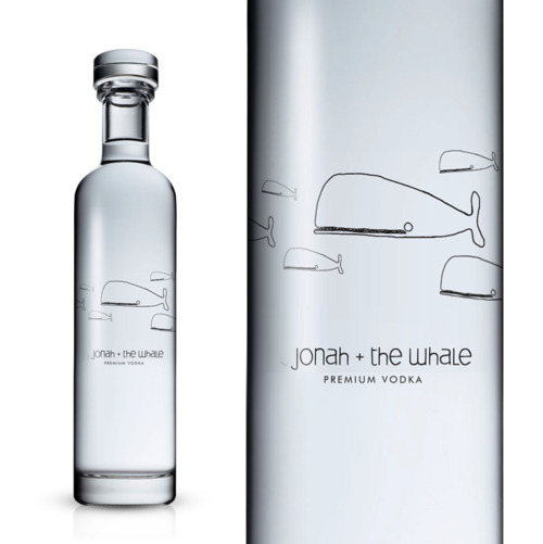
For example, while the bottle and cap design for Jonah and the Whale Vodka is exquisite, the logo itself doesn’t scream “Premium Liquor.” It’s more of what you would find on the cover of a Shel Silverstein poetry book. Once again, some liquor bottle designs are enhanced by a bit of whimsy, but combining childlike wonder and booze might be unseemly to some consumers.
Moreover, people want to think masters of the art with decades of experience and distil their premium liquor. They want to believe the whiskey has a rich family history of prohibition-era moonshine brewing’, not Hello Kitty fans.
Is the package design for a point-of-sale product?
It might be possible to get away with a minimalist packaging design for a product that the customer previously researched, or can scrutinize in the aisle. But the product sold right at the checkout is a different story.
The packaging that most needs to catch the eye is for products sitting right at the register. If an energy shot, candy bar or pack mints doesn’t delineate a product‘s many uses and benefits, it will likely be purchased as a checkout line divider. Opaque yet elegant packaging designs do not seduce the average Walmart shopper.
Minimalism is splendid at the right time and with the correct marketing strategy. We would all love to package our products in aesthetically interesting and mildly mysterious ways, but customers don’t have time to decipher your packaging code.
Once you’ve established your product‘s superiority and firm standing in the marketplace, go for an innovative and slightly weird concept. However, until you reach that glorious summit, go for what is clear and specific, with enough differentiation to create consumer interest. Your revenue stream will thank you.
The Number One Mistake in Minimal Packaging Design
We’ve teased you enough, so it is time to answer the question. The number one mistake that brands make with minimal packaging design is testing for its on shelf success. When including extensive testing, subjective decision making about what your customer believes to be minimal is no longer a factor. With the right testing methodology, you can sit back and let the data determine your desire.
Packaging Design Agency
Want a best-selling brand? Our packaging design process takes your product from design to print. The SmashBrand methodology for designing product packaging is a strategic approach to preliminary designs which are then tested for performance in simulated buying environments.
Book a time to discuss your project with our team.
Subscribe to
Nice Package.
A monthly newsletter that unpacks a critical topic in the FMCG & CPG industry.
Free Resource.

CPG product repositioning guide.
Explore the five undeniable signs your CPG product needs repositioning along with strategies for leveraging consumer insights for a guaranteed market lift.
Learn More About CPG product repositioning guide.